
Notícias
quarta-feira, 23 de agosto de 2017
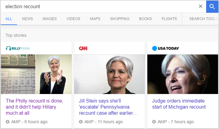
Aqui você encontra as últimas notícias e press releases relacionados à zFast.
quarta-feira, 23 de agosto de 2017
Dicas para logo AMP
Seu logo AMP é importante! Faça valer a pena.
O conteúdo abaixo está em inglês. São dicas muito importantes sobre como deve ser seu logo, principalmente para exibição em AMP.
Redação Canal Tech
fonte: https://medium.com/relay-media/amp-logo-best-practices-b096933dbc19
Your AMP logo is your brand’s first impression in Google’s AMP carousel, and your chance to signal quality and relevance to users. Here are a few tips for effective AMP logos:
1. First read Google’s AMP logo guidelines.
Here you’ll find basic format, dimension and padding requirements. The logo must fit in a 60 x 600 pixel box, but will be rendered in the AMP carousel at 16 x 160.
2. Don’t make people squint.
View your AMP logo at 16 pixels high; that’s how it’ll be viewed in the AMP carousel.
3. Your masthead graphic probably won’t work.
Website masthead graphics get pretty squished at 16 pixels high and are often designed for different dimensions than the AMP carousel space. Try a simple icon and graphical text instead.
Note: Some publishers are using an icon and html text instead of graphical text. This works, although it’s currently not mentioned in Google’s structured data documentation.
4. Tell users WHO and WHERE you are — don’t make them guess!
The AMP logo spec allows plenty of horizontal space, so use it to make sure your users know who you are! Include your full brand name and — if you’re a local publisher — the market you serve. This information can be important when you’re competing with other publishers in the AMP carousel.
Leia a matéria completa em:
https://medium.com/relay-media/amp-logo-best-practices-b096933dbc19
Redação Canal Tech
fonte: https://medium.com/relay-media/amp-logo-best-practices-b096933dbc19
Your AMP logo is your brand’s first impression in Google’s AMP carousel, and your chance to signal quality and relevance to users. Here are a few tips for effective AMP logos:
1. First read Google’s AMP logo guidelines.
Here you’ll find basic format, dimension and padding requirements. The logo must fit in a 60 x 600 pixel box, but will be rendered in the AMP carousel at 16 x 160.
2. Don’t make people squint.
View your AMP logo at 16 pixels high; that’s how it’ll be viewed in the AMP carousel.
3. Your masthead graphic probably won’t work.
Website masthead graphics get pretty squished at 16 pixels high and are often designed for different dimensions than the AMP carousel space. Try a simple icon and graphical text instead.
Note: Some publishers are using an icon and html text instead of graphical text. This works, although it’s currently not mentioned in Google’s structured data documentation.
4. Tell users WHO and WHERE you are — don’t make them guess!
The AMP logo spec allows plenty of horizontal space, so use it to make sure your users know who you are! Include your full brand name and — if you’re a local publisher — the market you serve. This information can be important when you’re competing with other publishers in the AMP carousel.
Leia a matéria completa em:
https://medium.com/relay-media/amp-logo-best-practices-b096933dbc19